Treeconomics
Overview
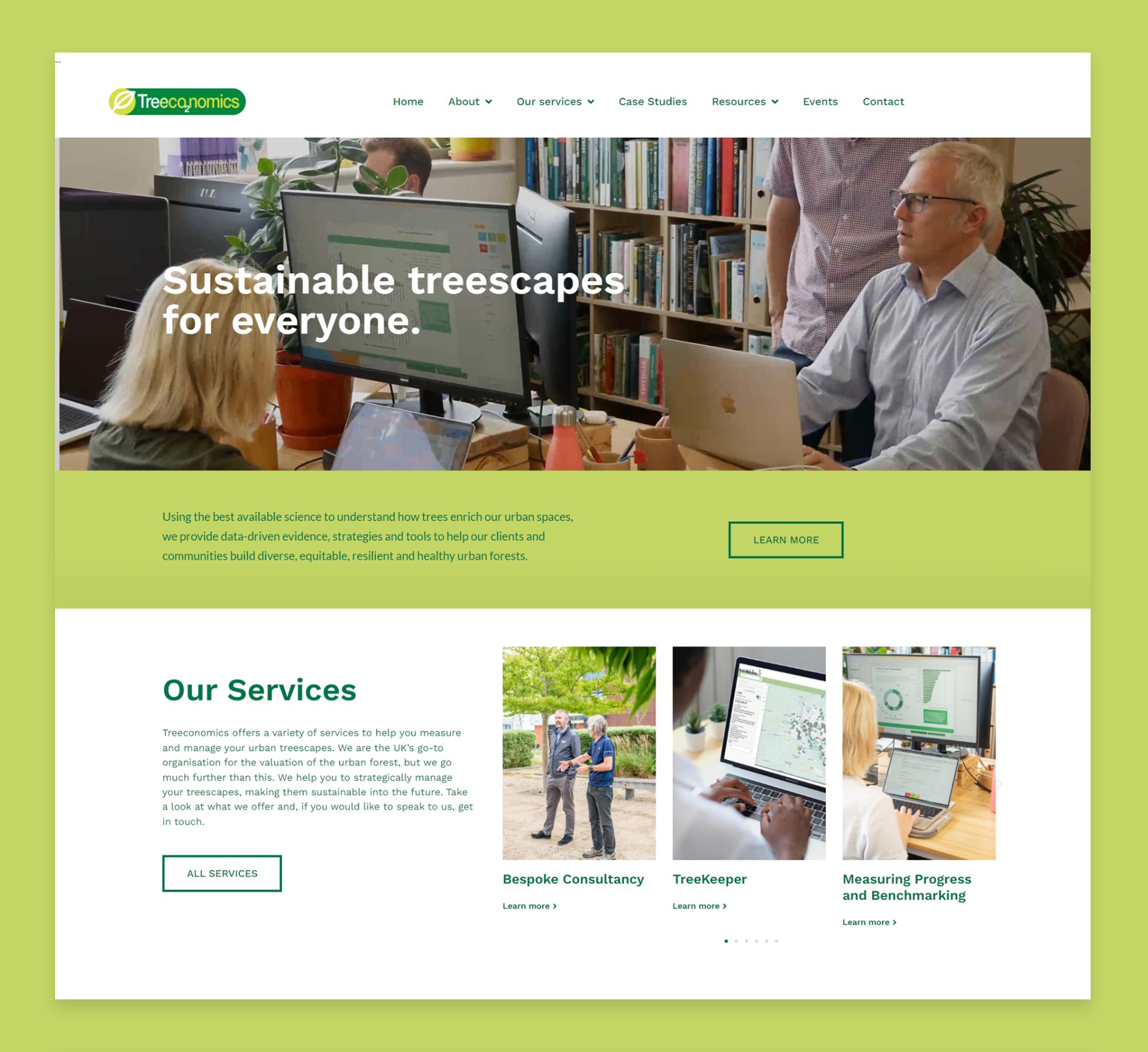
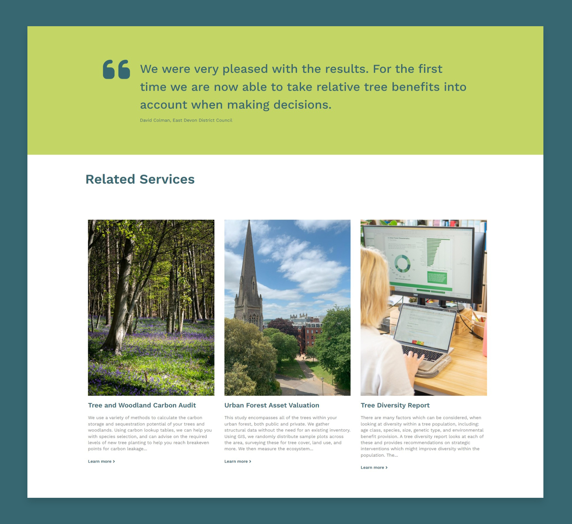
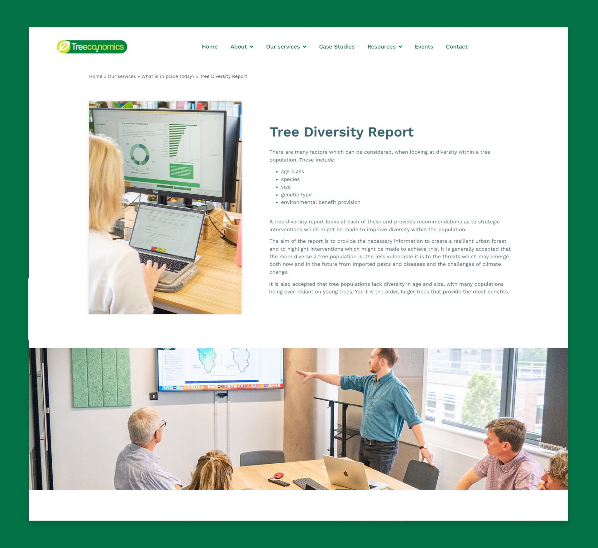
Working closely with Treeconomics, the brief was to enhance the Treeconomics brand through a fresh website design that includes a more personable look, a variation of colour, and a more animated feel to bring the site to life. The site needed to clearly communicate to prospective customers the purpose and values of the brand, its mission, and the services that it can offer to help.
After an initial scoping meeting to discuss exactly where the Treeconomics brand was heading, its new and updated mission, and the target audience it was looking to engage with, we set about mapping out and wireframing a new website, that included the following:
- Enhanced colour pallete – Varying existing colours in the company’s logo and corporate branding, whilst extending the pallet.
- Improved navigation – Making it easier for users to navigate to the content most relevant to them.
- Photography & Videography – Adding a more personable feel to the brand by placing the team centre stage.
- Animation – Adding movement and colour to attract users to crucial information and call to actions.
- Customer focussed content – The addition of a ‘how we work with you’ section, tailored to key personas.
- Gated content – Allowing Treeconomics to build value from their new website by generating new leads.
- client
- role
- year
- Treeconomics
- Lead Designer, Photographer, Developer
- 2023


